For Marinochem, a leader in chemical solutions with a strong industry presence, standing out is essential. Operating in a technical and specialized market, Marinochem needed a refined brand identity that would reflect both it’s expertise and it’s commitment to innovation. The goal was not merely aesthetic; it was to redefine Marinochem’s visual presentation in a way that truly resonated with its partners, clients, and stakeholders.
The project had clear objectives from the outset: create a logo that speaks to the company’s modern, innovative approach, and develop a brochure website that clearly communicates Marinochem’s mission, services, and impact. This new identity would need to embody Marinochem’s strengths and vision, fostering trust and enhancing recognition. In an industry where clarity and reliability are paramount, Marinochem’s rebranding was designed to convey authority and expertise at every touchpoint.
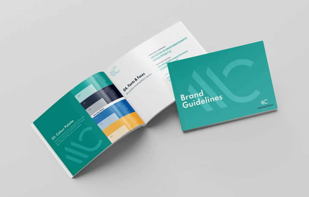
Our team chose a new logo design that emphasises simplicity while incorporating subtle, meaningful elements. The color palette reflects stability and trust, combining deep blues and greens that not only nod to Marinochem’s work within chemical solutions but also evoke a sense of balance and environmental consciousness. The logo’s typography was selected for its modern, clear lines, designed to be both memorable and functional across a range of applications, from digital to print. Each element of the logo was carefully chosen to ensure that it communicates the company’s commitment to quality and reliability in a sophisticated and approachable way.
With the logo complete, our attention turned to creating a brochure website that would act as Marinochem’s digital calling card. The website’s purpose was straightforward but critical: provide an informative, engaging platform where clients and partners could easily access essential information about Marinochem’s services and expertise. A brochure website needs to balance aesthetics with functionality, and every page of Marinochem’s site was built with this principle in mind.
The new logo and website come together to form a cohesive brand experience that strengthens Marinochem’s market position. By crafting a brand identity that is both modern and timeless, Marinochem is equipped to move confidently forward, ready to meet the demands of its industry and maintain a distinct, recognizable presence in the market.
Heartily recommend Doodle Creative. They designed a new logo for us, with and a number of colour and layout options, and all the appropriate branding material (style guides, document and presentation templates, business cards etc.). They then followed this up with an excellent, responsive, website - www.marinochem.ie . Jeremy was very responsive (and patient!) and was a pleasure to work with. Our corporate look has been totally transformed as a result.


